.png)
About the app
The words this guide uses, keyboard and screen-reader support, light and dark, and what the app keeps between visits.
The words this guide uses
The app has a vocabulary of about ten things. They are all on screen, but it is easier to have them in one place.
The app calls them whatever your selection calls them. Pick only Product Discovery work and it says ideas; pick only service-project work and it says requests; anything else — including a mix of products — and it says issues. The word follows through about thirty places, from the button label to the send guard and the results heading. This guide says “issue” throughout.
| Comment composer | One issue on the Comment step, with its own comment editor, attachments and status control. Twenty-five issues means twenty-five composers. |
| Issue navigation | The column down the left of the Comment step. One row per issue in the batch; press a row to jump to its composer. |
| The details panel | The read-only column on the right, showing the description, fields, attachments and comment history of whichever composer you are on. |
| The tray | The strip along the bottom of the Select step holding a chip per issue you have picked, with the n / 25 selected counter. |
| Internal note | Service projects only. A comment only agents can see. Tinted yellow everywhere in the app. |
| Reply to customer | Service projects only. A comment the customer sees on the portal and receives by email. It cannot be recalled. |
| Second comment | One request carrying both — a reply and the internal note behind it, written separately and posted together. |
| The send guard | The confirmation that appears before a risky send, counting what is about to go out. |
| Ready / Status only | A composer with something to post / a composer that will only move status. An untouched composer carries no badge and is skipped. |
| Batch | The issues you picked, taken together. One send posts one batch. |
Keyboard and screen readers
Everything in the app is reachable without a mouse, and the places where that is easy to get wrong were rebuilt rather than patched.
- Nothing is hover-only. The × on a list row, the Only shortcut on a status, the controls on a composer header — all of them are always rendered, because a control that appears on hover cannot be reached by Tab.
- The list down the left opens on focus, not only on hover, so tabbing into the rail expands it.
- Menus behave like menus. Opening the ••• menu or the status picker puts focus on the first item; ↑ and ↓ wrap around; Home and End jump to the ends; Esc closes and puts focus back on the button you opened it from, so you never lose your place.
- The confirmation dialog traps focus and starts on Cancel — deliberately, because a button fires on Enter being pressed down, so starting on the send button could post the batch with the same keypress that opened the dialog. Esc cancels, and focus returns to where it was.
- Progress is announced. The composer disappears the moment a send starts, so the line reporting progress is a live region — a screen-reader user hears the send run and hears its outcome, rather than silence.
- Selected issues are announced as checkboxes, with their state. At the 25 ceiling the remaining rows stay reachable and explain why they cannot be picked, instead of being switched off and going silent.
- Every control says what it will do to which issue — not “Remove” but “Remove PAY-412 from this batch”, not “Only” but “Show only In Review”.
- Keyboard focus is always visible, and the image viewer is a proper dialog with Esc and arrow keys.
Light and dark
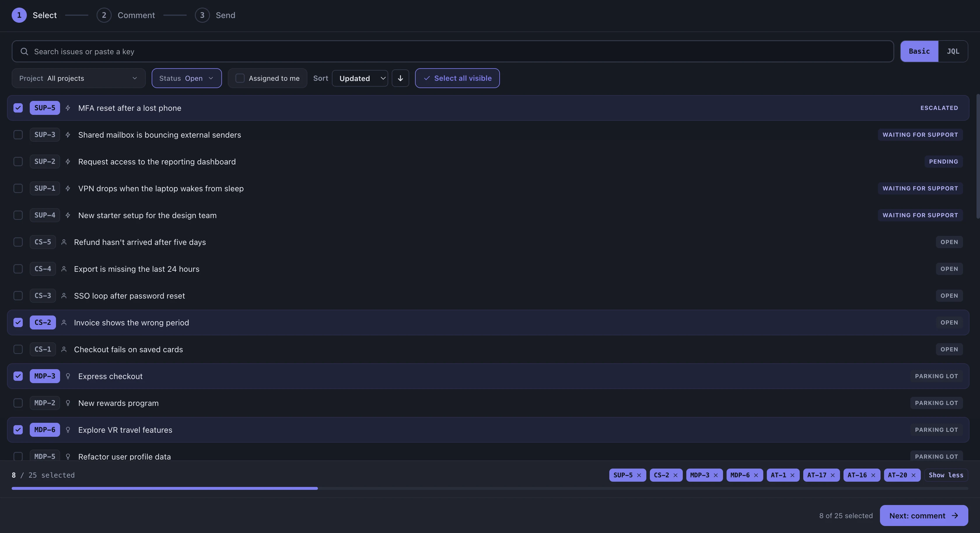
There is no theme setting, because the app has no theme of its own. It renders in whichever colour scheme Jira hands it — including the editor, the status lozenges and the readiness badges, which are tinted per scheme rather than inverted.
Every screen in this guide looks like this in dark:
What the app remembers
Everything below is stored in your own browser, on your own machine. None of it is sent anywhere, and none of it is visible to anyone else — clearing your browser data clears all of it.
- Your comments, as you type them — every composer’s draft is saved continuously, so a refresh, an accidental tab close or a Jira navigation does not cost you the batch you have written. Reopening the app restores the drafts and re-selects the issues they belong to, so you land back where you were rather than on an empty Select step.
- The layout — whether the issue list on the left is pinned open or collapsed to a rail, whether the details panel is open, and the width you dragged each of them to.
- Recently seen issues — a small cache of issue summaries so a batch restored from a draft can show its titles immediately rather than blank rows while Jira answers.
Clear all comments & status changes clears the saved drafts too, so it is the deliberate way to start over rather than something you have to hunt for.